Wallpaper keeps evolving, and 2026 is shaping up to be a warm, tactile and confident year for it. If you’re thinking about a feature wall or a whole room, here’s where the design world is heading, and how to use a trend without your home looking dated in three years.
What’s in for 2026
Texture and natural materials. The clearest direction is away from flat, printed looks and towards surfaces with depth: grasscloth, plaster-inspired finishes, linen weaves and papers that feel handmade. They read as “grounded and calm,” and they bring a tactile quality that flat paint and glossy prints can’t match.
A return to colour. After years of grey and greige, colour is back as a way to make a home feel personal and uplifting. That doesn’t mean loud for the sake of it: think tone-on-tone schemes, muted blues, warm yellows and soft pinks, used with intention.
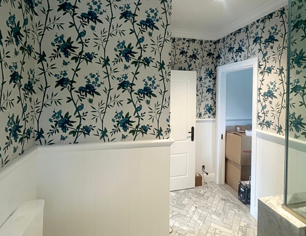
Refined heritage patterns. Classic designs are being reimagined for modern rooms: silk-like surfaces, elegant damasks and traditional motifs in updated, nature-inspired palettes. It’s a look that suits Wellington’s older villas and character homes especially well.
Nature’s influence. Greenery, botanicals, stone and wood tones continue to grow in popularity, tapping into the idea that a calm, nature-connected home is good for wellbeing. Medium-scale botanical prints are favoured over enormous, busy florals.
Wallpapered ceilings. Designers are increasingly treating the ceiling (the “fifth wall”) as the place to add a surprising, characterful touch.
What’s on the way out
- Overly busy, high-contrast patterns like stark black-and-white geometrics that overwhelm a room rather than lifting it.
- The default single accent wall. Not gone, but no longer the automatic choice; a considered whole-room or ceiling treatment often feels more intentional.
- High-gloss, shiny finishes that look flat and lifeless next to today’s textured papers.
- Tired retro repeats, like 1970s-style prints and over-used geometrics such as chevron and herringbone that no longer feel special.
How to use a trend without dating your home
Trends are a useful starting point, not a rulebook. A few principles keep a room feeling fresh for the long haul:
- Anchor the bold stuff to easily-changed surfaces. Wallpaper is more committal than a cushion but less committal than new flooring. Put your personality there, and keep the expensive, permanent elements more neutral.
- Choose the version of a trend that suits your actual home. A heritage Thorndon villa and a modern Churton Park build call for different papers. Work with the bones of the house, not against them.
- Prioritise quality and installation over chasing the newest look. A well-chosen, well-hung paper looks considered for years; a trendy one hung badly looks dated immediately.
Bringing it to life in Wellington
The textured, nature-led direction of 2026 genuinely suits local homes. It works with our light, our character housing and our love of the outdoors. If you’ve seen a trend you love and want to know whether it’ll work in your space, that’s a conversation we enjoy having.
Silver Fern Painting are Wellington’s wallpaper specialists. We’ll help you choose a paper that fits your home and your budget, and install it so it looks the part. Get in touch for a free quote.
Trend directions in this article are drawn from 2026 industry forecasts and designer commentary; specific choices should always suit your own home.